Stream Serve And Classic :
Formatting the GridView
In the examples we've looked at so far, the GridView's output is a tad drab and unattractive.
In Figure , for example, the GridView's output lacks any color. The text in the header of each column matches the DataSource field names exactly, like ProductName (without a space between Product and Name), whereas it would make more sense to display it as Product Name or perhaps just Product. Fortunately, all of these tasks are easy to accomplish with the GridView, most of which can be accomplished throughthe Design view without a line of code. There's even an Auto Format wizard to help improve the aesthetics of theGridView for folks like me who have no artistic skills. In this section we'll look at how to format the GridView through properties that can be set through the Designer, how to format based upon the actual data bound to the GridView, and how to use skins to alter the appearance of the GridView.
Examining the GridView's Aesthetic Properties
Like the DataGrid in ASP.NET 1.x, the GridView contains a wealth of properties that can be set to gussy up the appearance of the GridView. Properties such as BackColor, Font, and ForeColor allow you to dictate the aesthetics for the entire GridView. You can also specify aesthetic settings specific to particular parts of the GridView through the HeaderStyle, RowStyle, AlternatingRowStyle, FooterStyle, and other properties. Additionally, styles can be set on a column-by-column basis, as well.
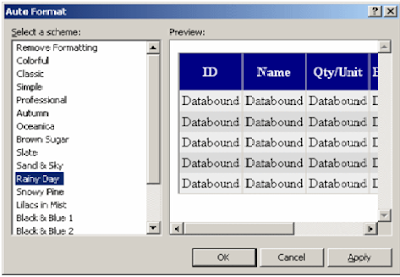
If you are an artistic person you can likely put together proper colors and styles that will provide the end user with an eye-pleasing GridView. If you are like me, though, the good news is that the GridView can be Auto Formatted to a variety of well put together styles. To take advantage of the Auto Formatting, simply click the Auto Format link in the GridView's Smart Tag, which will display the Auto Format dialog box shown in Figure.


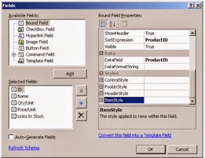
The lower left-hand corner lists the columns in the GridView. From this dialog box you can adjust the ordering of the columns or remove or add columns altogether. To reorder the columns in the GridView, click on a column and then click on the up or down arrow to adjust its position in the column list. To remove a column from the GridView, select the column then click the X button to delete it.
When you click on one of the columns, its properties are listed in the pane on the right. From the ItemStyle property you can set formatting properties for the items of the column, such as how the data should be horizontally aligned, or if the data should be displayed in a bold font. You can change the text that appears in the header of the column through the HeaderText property. To format the data in the columns, use the DataFormatString property, setting it to {0:format string}. For example, to have the UnitPrice column formatted as a currency, I set the DataFormatStringproperty to {0:c}.
Note To learn more about the various possible values for format strings, refer to the section in the .NET Framework documentation.
Figure 13 shows a screenshot of a formatted GridView displaying data from the Products table. Notice that the text in the headers has been changed from their default values to more user-friendly values. The GridView has also been given some color (I used the Brown Sugar option in the Auto Format dialog box), the Price/Unit and Units In Stock columns' data is right-aligned, and the Price/Unit column's data has been formatted as a currency.
GridView .NET component
ReplyDeleteThis comment has been removed by the author.
Delete